Brand Standards
When crafting our mark, much consideration was given to the elements conveying the brand essence of Samaritan Medical Center. The main diamond shape represents prestige, while its rounded corners help soften our image and project the quality of care our patients receive.
Signifying our namesake, the S in the middle of the diamond showcases forward thinking and our thoughtfully expansive investment. It also moves like a river, highlighting the great natural waterways in our region.
The two blue colors represent trust and loyalty—values we uphold every day for our patients and our community.

Mission
Samaritan shall provide high quality, comprehensive, safe and compassionate healthcare services to meet the needs of our civilian and military community.
Vision
Samaritan shall embrace a patient-centric culture and partner with patients to achieve the best outcome and experience. Patients’ needs drive every decision.
Primary Logo
Presenting our brand in a consistent manner is integral to building a connection between our logo and our brand in the eyes of the recipient. The Samaritan family of logos should never be altered or adapted in any way that goes beyond the downloadable brand guidelines on this page.
Download digital | Download print

Secondary Logo
The Samaritan Health logo is the overarching brand. It should be used when referring to a division or service line that does not have a logo, that operates apart from the Medical Center or when referring to more than one division, service line or the entire organization.
Download digital | Download print

Other Logos
Certain service lines and other locations require individual logo marks. Service line lock-ups are appropriate almost exclusively for internal use. All external marketing and communication logo use will be determined by the Samaritan Medical Center marketing team.
If you have questions about usage in a particular situation, please consult the Samaritan Medical Center marketing team at 1-315-785-4584.
Color Palette
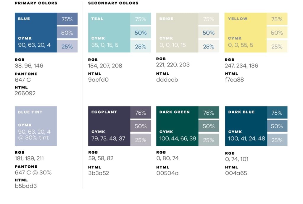
The color palette is a key element of the brand’s identity. The colors chosen play a vital role in portraying Samaritan as both advanced and compassionate. Please ensure the colors you use in communications adhere to our approved specifications.

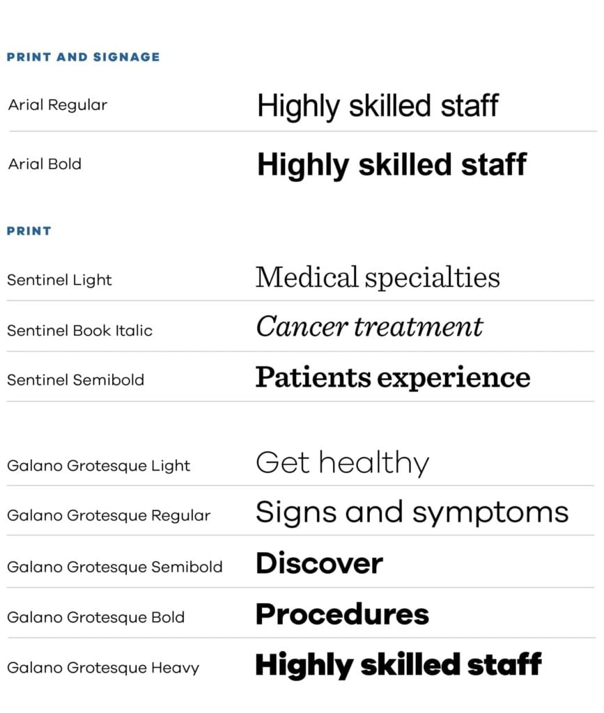
Print Typography
Arial, Sentinel and Galano can be used for print, digital and indoor/outdoor signage. Use of other fonts is not permitted. Arial is used as the general font and is also the primary font for indoor/outdoor signage. Arial should never be italicized.

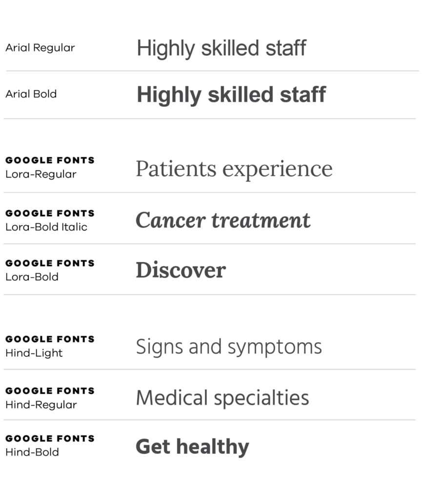
Digital Typography
Arial, Lora and Hind are to be used for digital applications, including those appearing on smartphones, tablets, desktop computers and other screened devices. Use of other fonts is not permitted.


